client
Santander
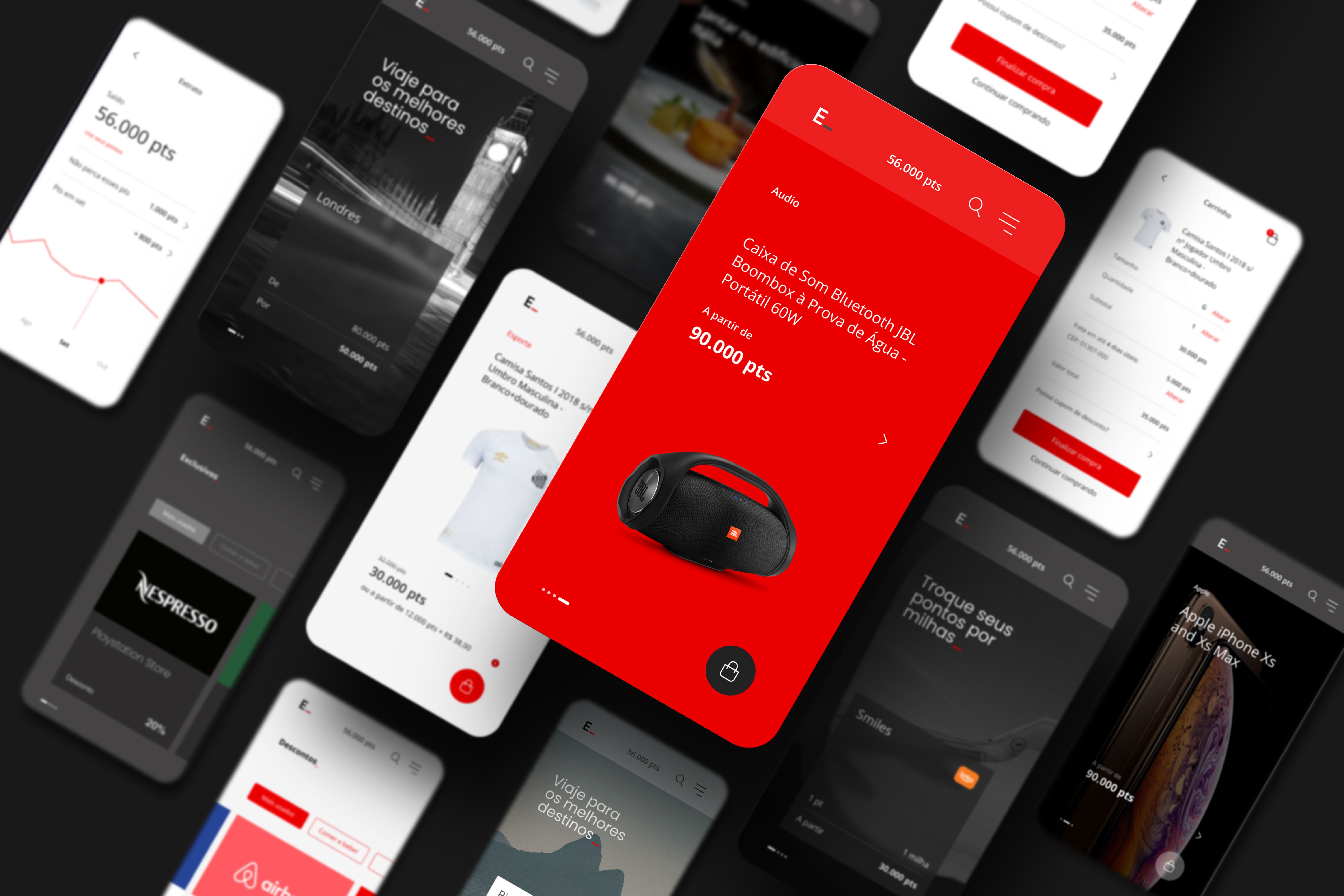
Santander Esfera is Santander Bank’s loyalty and rewards program, created to connect customers to a broad ecosystem of products, services, and partners. Our work consisted of a strategic design consultancy focused on rethinking the user experience and redefining Esfera’s role within this ecosystem, bringing the loyalty program closer to the bank’s core operations—such as accounts, cards, and investments.
Throughout the project, we worked collaboratively with Santander’s business and technology teams, leading research, validation efforts, and design sprints to support strategic decision-making, evolve value propositions, and deliver a more integrated, seamless, and user-centered experience.
Overview
Designing a Connected Experience Across the Esfera Ecosystem
At the beginning of the design consulting project for the development of Santander’s Esfera loyalty program, we dedicated significant time to deeply understanding the challenges faced by both users and the business team. We conducted extensive research to identify customer needs, expectations, and pain points, as well as Santander’s strategic objectives. These insights guided the creation of effective design solutions aimed at improving both user experience and the bank’s business outcomes.
Santander recognized the financial potential of the Esfera program and the importance of integrating the loyalty ecosystem with other banking products. This integration sought to deliver a seamless, frictionless experience for users, placing them at the center of the bank’s operations.
Throughout the project, we conducted 15 design sprints, each lasting four weeks, in close collaboration with Santander’s stakeholders. We addressed a wide range of challenges, from validating specific needs to understanding customer behavior. Each sprint deepened our understanding of the pain points faced by users and the business team, continuously feeding the design process with valuable insights.
In every sprint, we implemented a comprehensive product discovery process, allowing us to approach challenges from multiple perspectives. We carried out in-depth user research, ranging from guerrilla usability testing on the streets with unknown participants to the recruitment of users with defined profiles, combining both qualitative and quantitative methods. During sprint planning, we dedicated significant time to carefully sizing and structuring the design team’s activities, ensuring a balanced workload and a healthy working environment for all team members. We also invested heavily in visual design refinement and high-fidelity prototyping, ensuring that test results accurately reflected the final product. At the end of each sprint, we delivered detailed presentations sharing all learnings gathered throughout the process, ensuring clear communication and alignment with all stakeholders.

Sprint 01
Refining Visual Language and Microinteractions
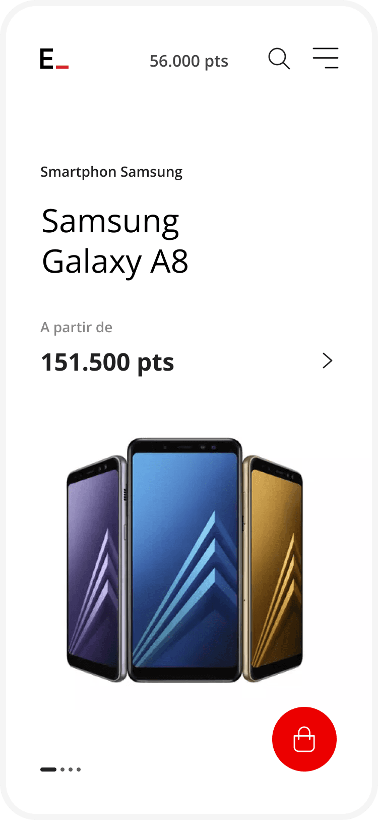
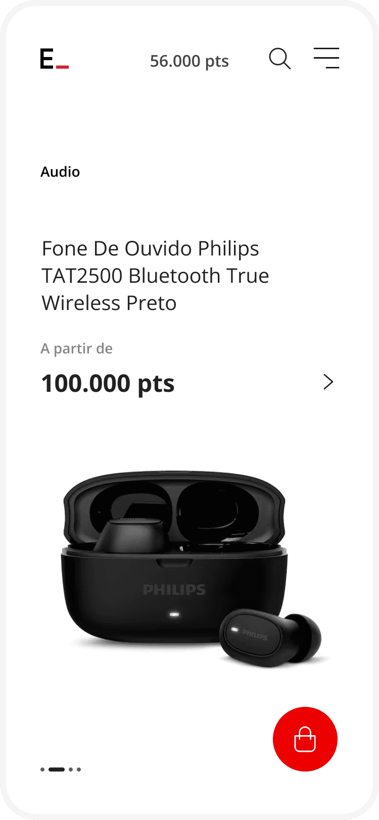
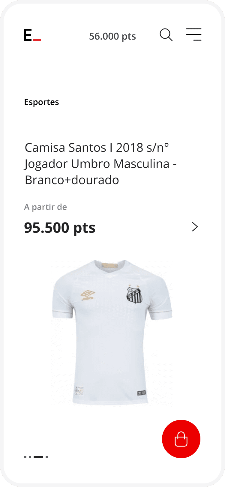
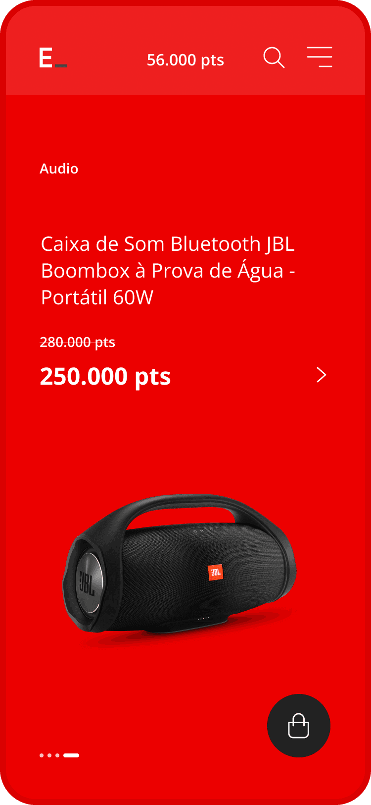
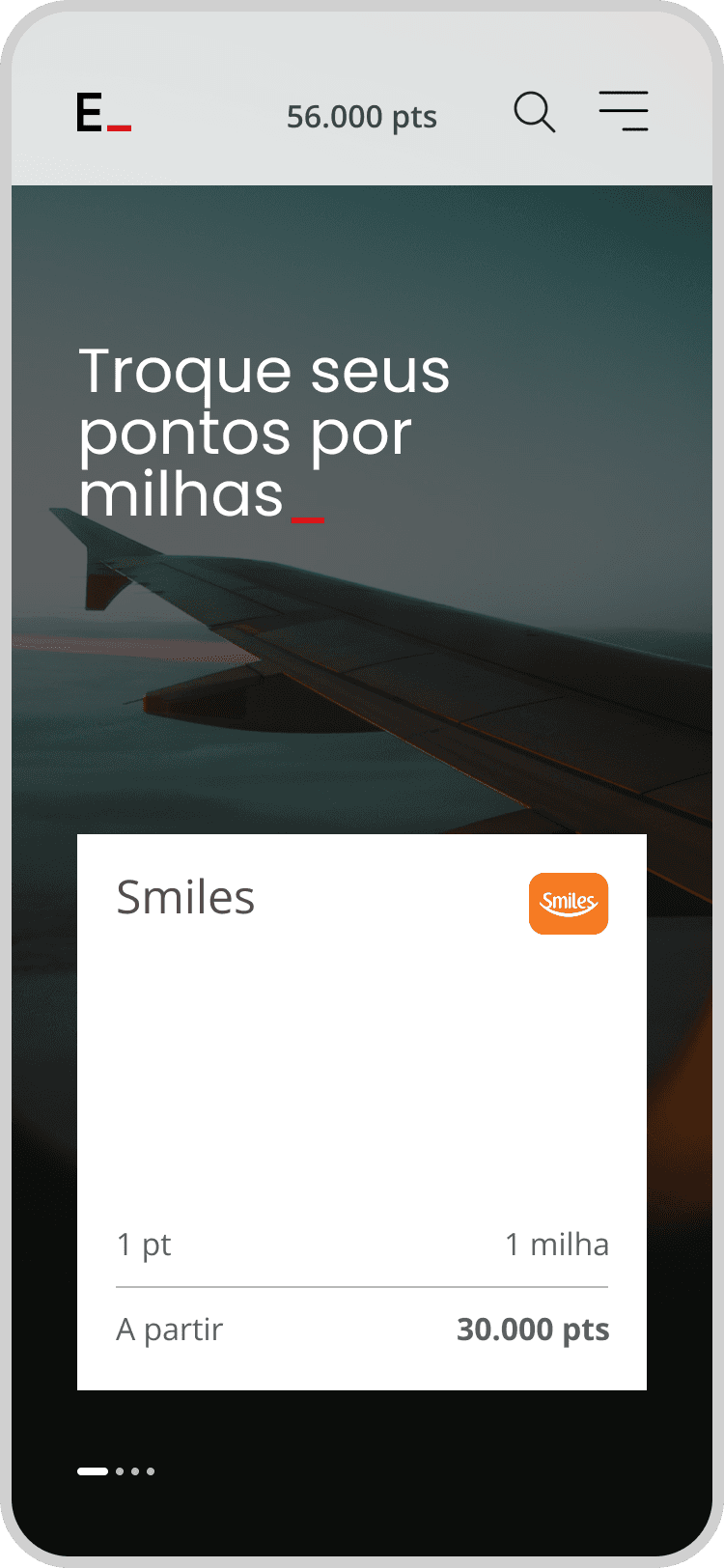
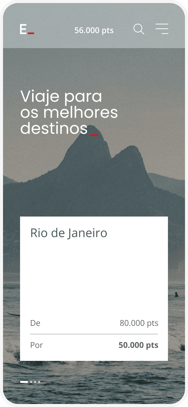
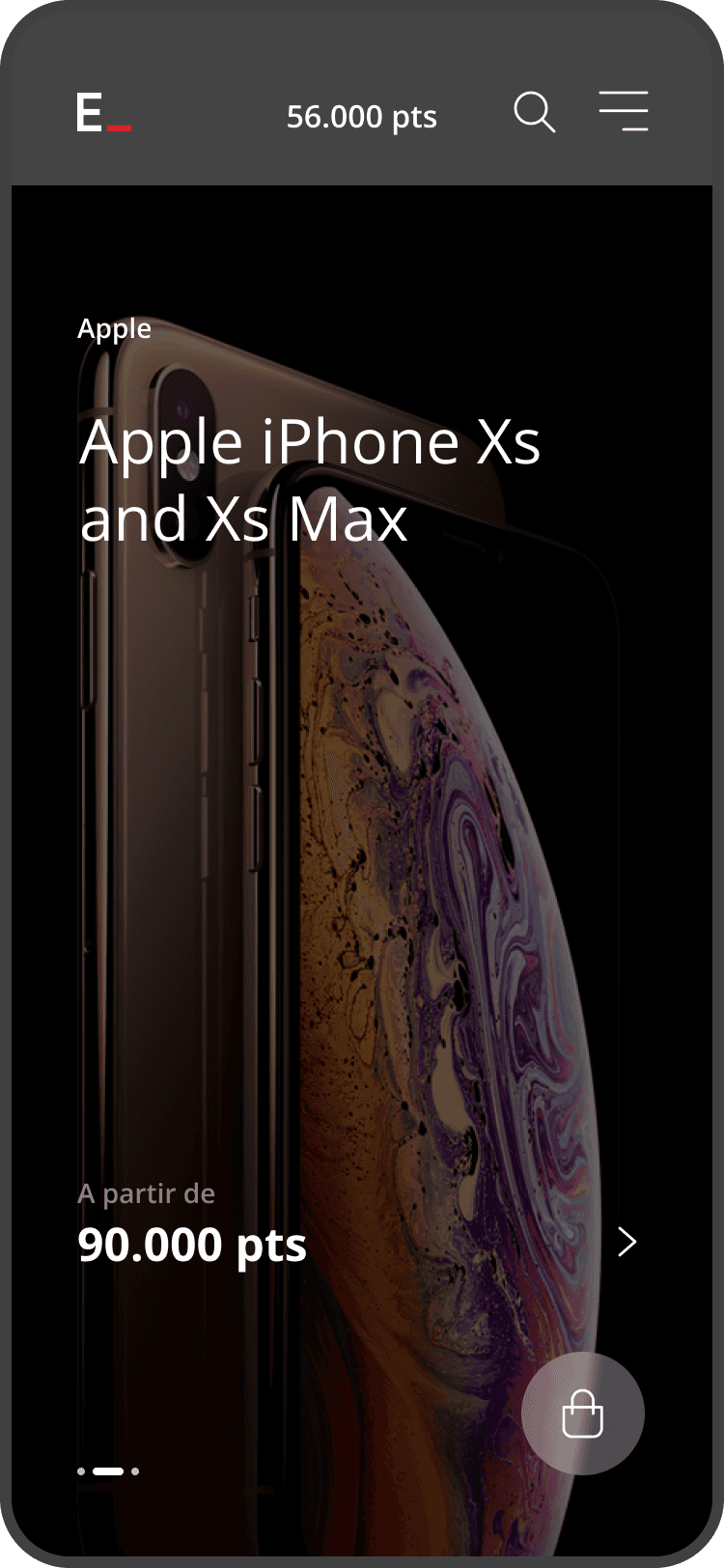
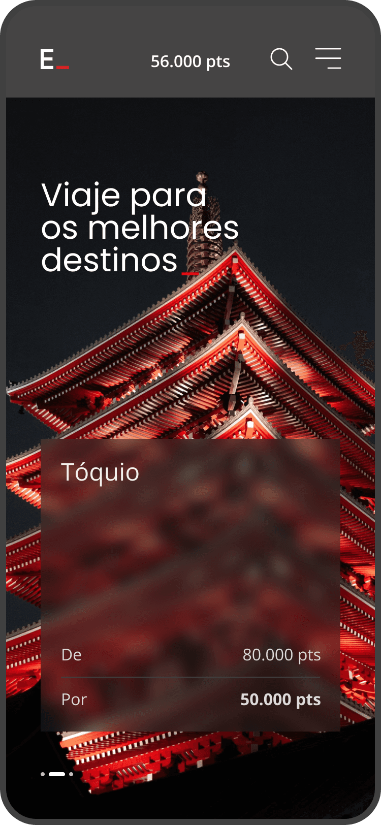
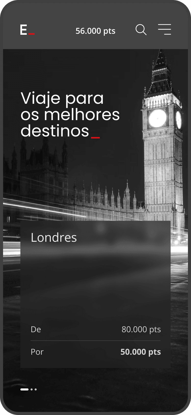
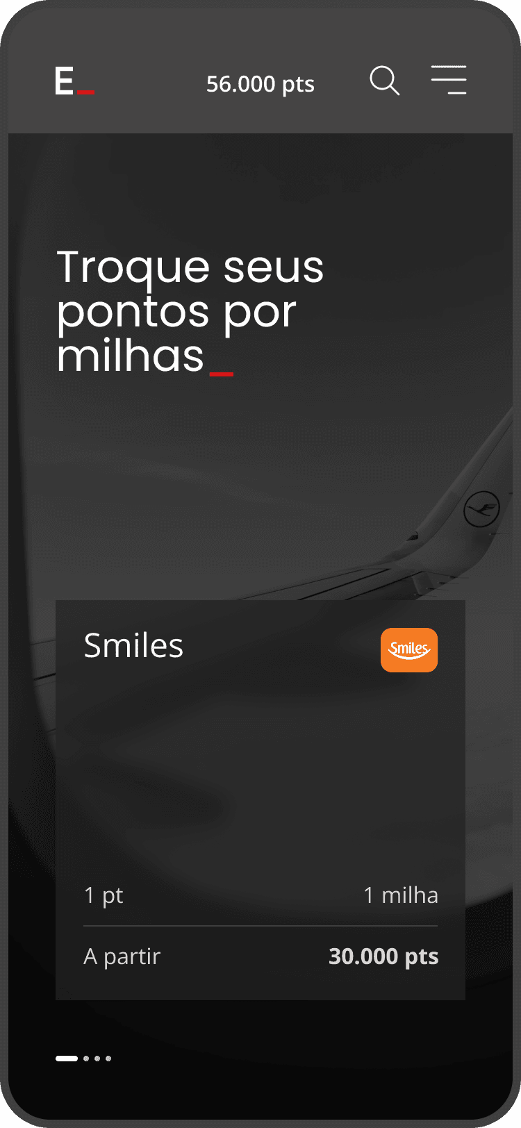
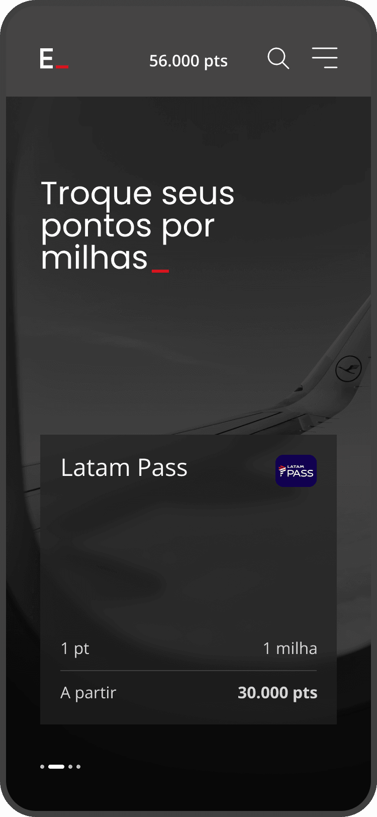
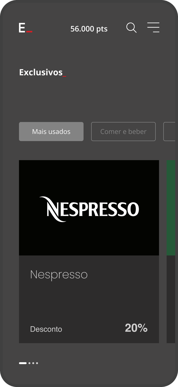
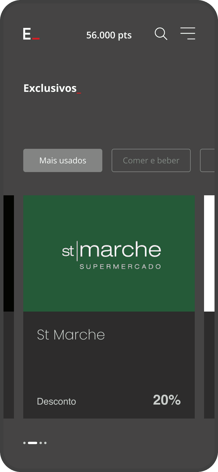
One of my first focuses in the project was to propose improvements to the visual design and microinteractions of the interface. I developed specific studies for the initial product offers carousel, responsible for presenting personalized products based on the user’s profile.
My main contribution was bringing a fresher and more refined design perspective, elevating both the aesthetic and functional quality of the experience. I explored new motion design and microinteraction solutions that made navigation more fluid and helped users better understand product offerings and information hierarchy, strengthening perceived value.
Sprint 02
Designing a Flexible Redemption Model (Points + Cash)
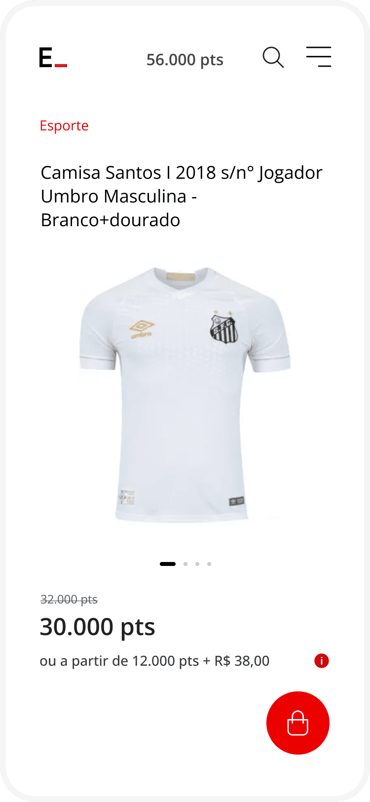
In this sprint, we conducted an in-depth discovery process to understand a new redemption model: combining points with cash, credit card, and installment payments. We deeply investigated how users perceived this type of transaction, including their expectations, concerns, and mental models.
This research was essential to build a simple and well-resolved experience despite the product’s complexity. The challenge was translating complex business rules into an intuitive flow that gave users clarity and control over their payment decisions.
Sprint 03
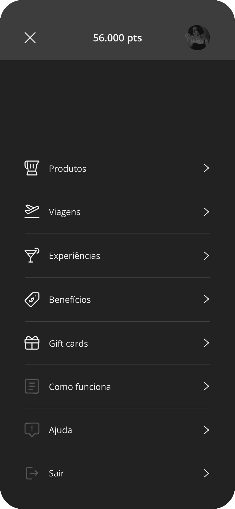
Menu & Information Architecture
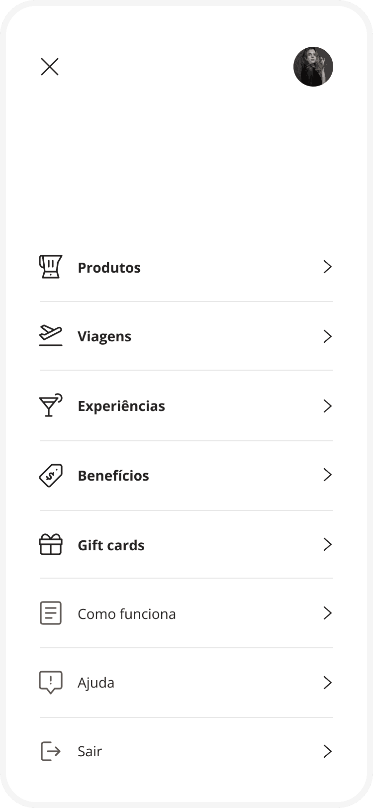
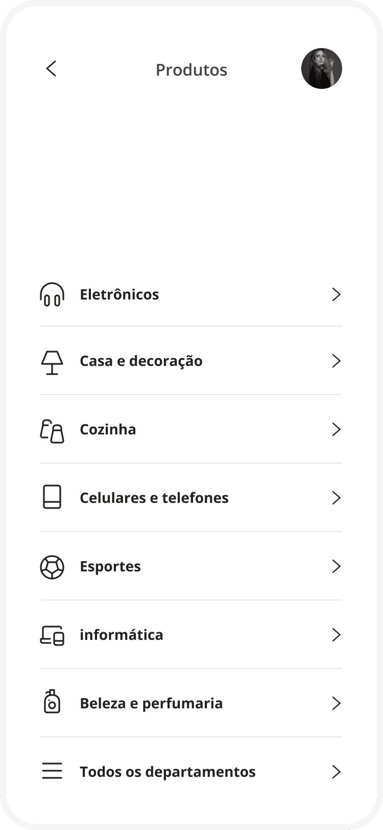
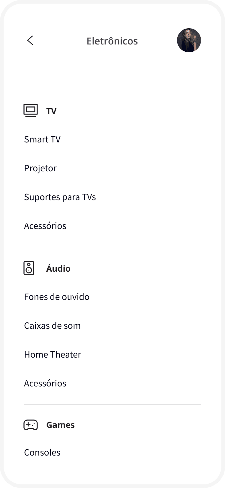
The Esfera program offers a wide variety of products, categories, offers, and payment options. In this sprint, our main challenge was organizing this ecosystem in a clear and understandable way for users.
We conducted research together with Santander’s team and customers, promoting a collaborative solution-building process. Based on these insights, we designed a new menu structure that balanced catalog depth with navigation simplicity, resulting in a clean, refined, and highly structured design.
sprint 04
Making Transactions Clear and Transparent
The sprint focused on the points statement involved a high level of complexity. We mapped all possible transaction scenarios, including payments with points, different card types, combined payment methods, refunds, and transfers.
Our goal was to transform this complexity into a clear and transparent visualization for users. We refined information organization and interface design so each transaction could be easily understood, allowing users to review their spending and earned points in a simple, objective, and reliable way.
sprint 05
Miles Purchase & Sale
The sprint focused on the miles purchase and sale flow was driven by deep research. We interviewed heavy users and specialists in the miles market to understand their behaviors, strategies, and expectations.
Based on these insights, we designed an experience focused on clarity, efficiency, and trust, aiming to create the best miles buying and selling flow in the market by translating complex rules into a simple and intuitive interface.
sprint 06
Creating a Premium Experience for High-Income Customers
The sprint focused on Santander Select customers was one of the most strategic phases of the project. We conducted extensive qualitative research, interviewing more than 50 Standard and Select clients to understand deep differences in behavior, expectations, and consumption patterns.
The findings revealed clear contrasts between the two audiences: while Standard users were primarily interested in more utilitarian benefits, such as movie and food delivery discounts, Select clients sought exclusive experiences, including fine dining, spa days, international travel, and VIP lounge access.
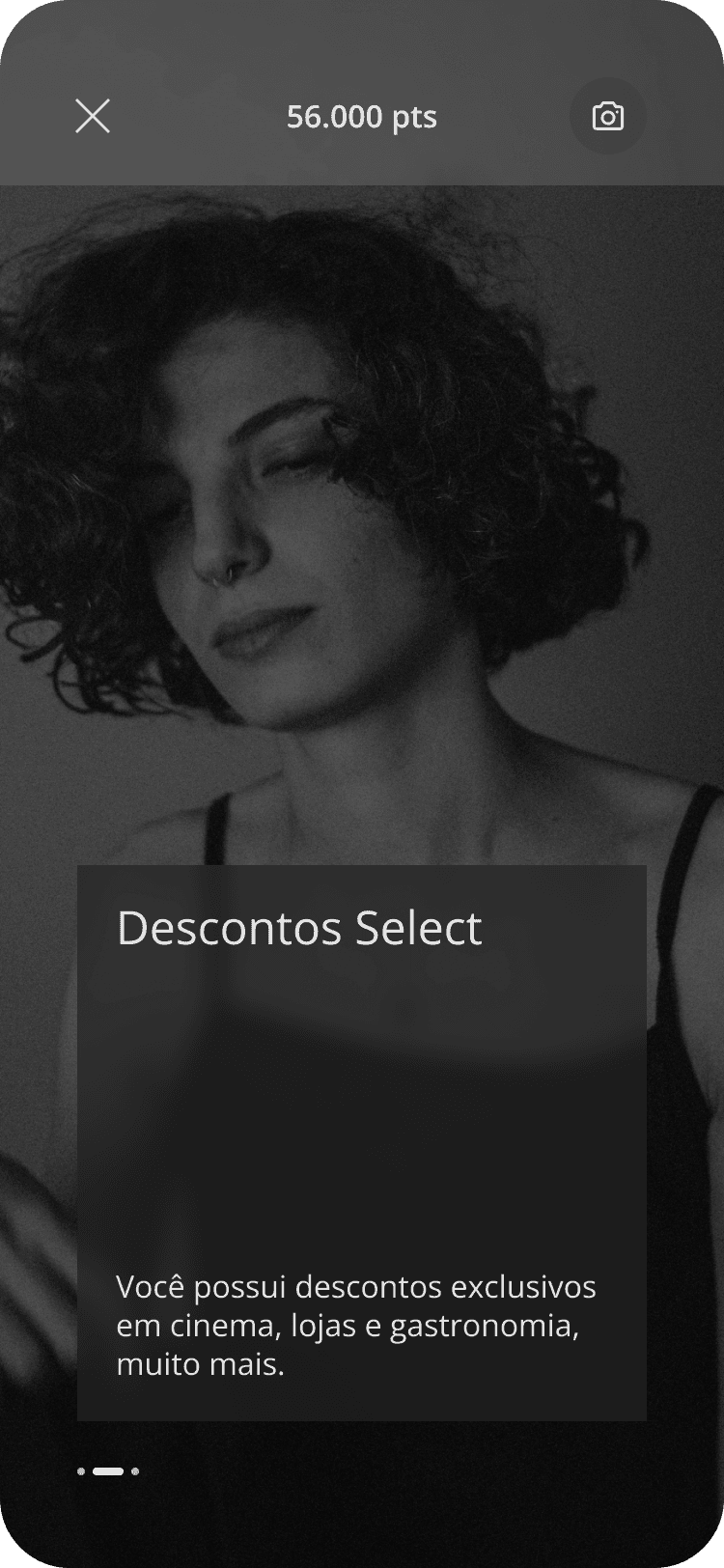
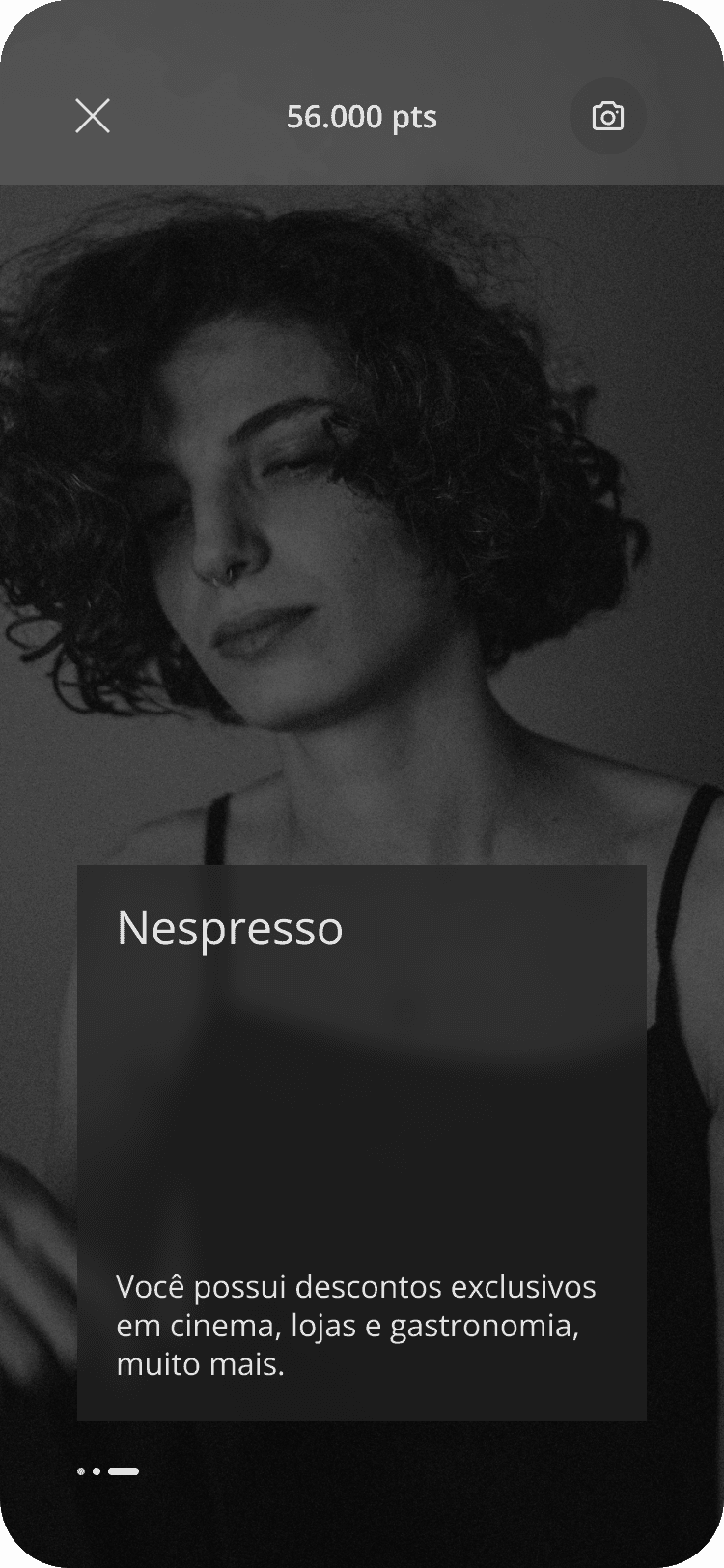
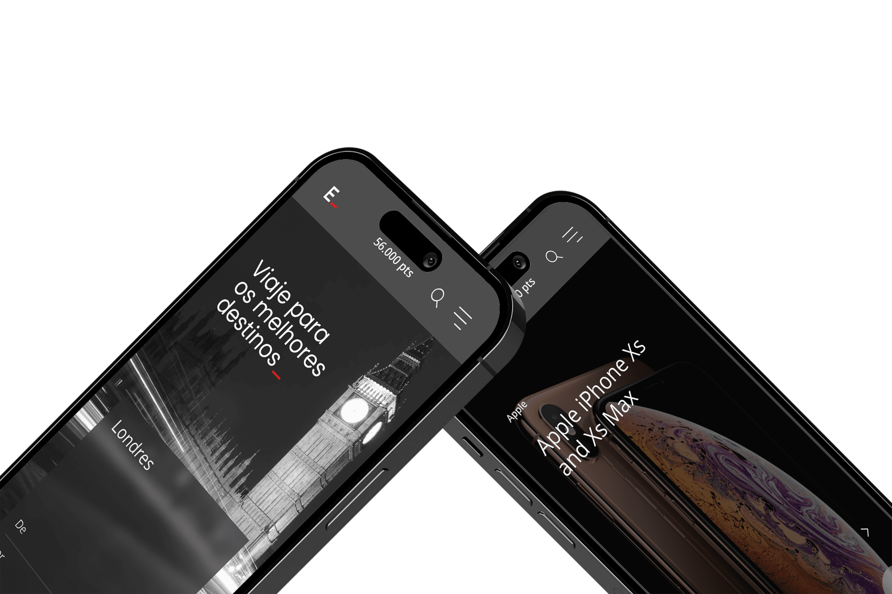
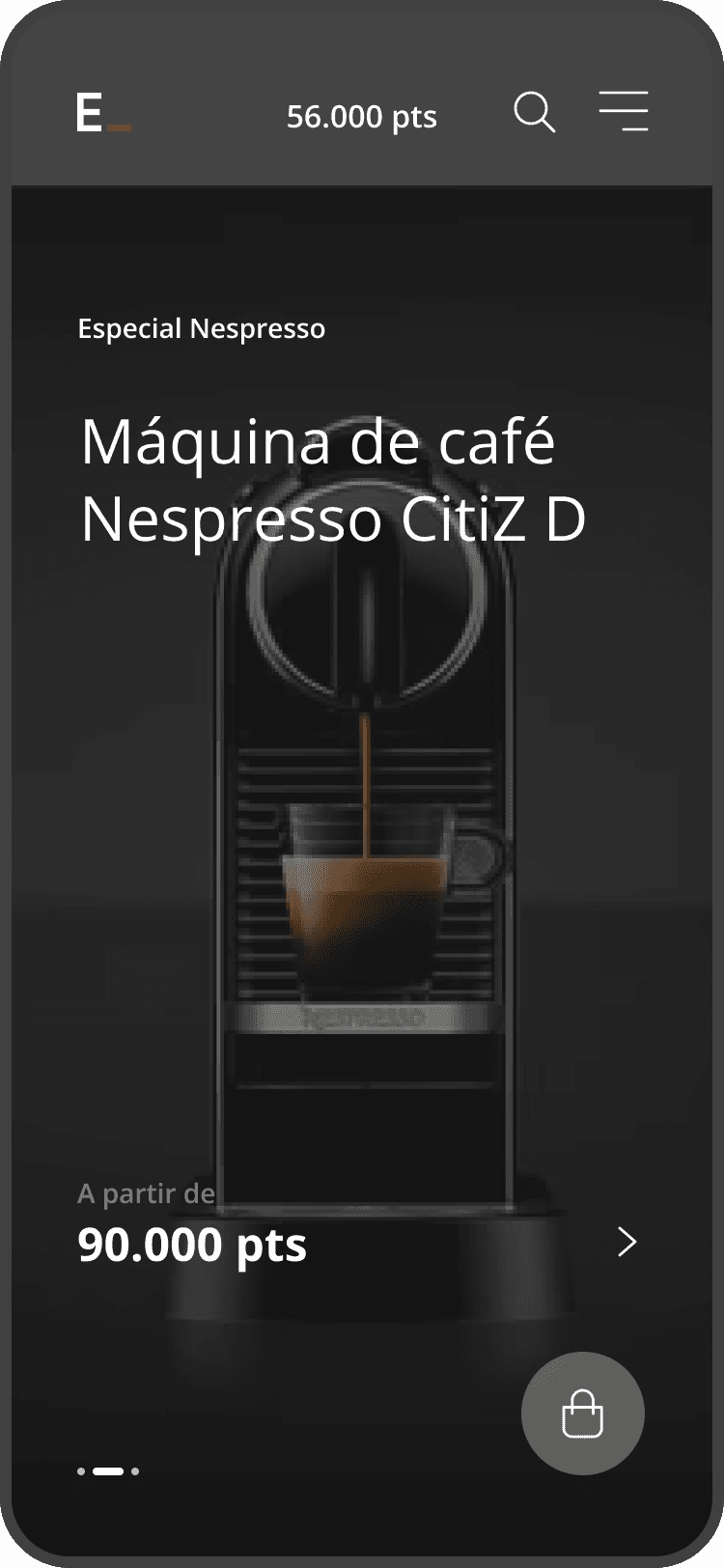
One of the most significant insights was the importance of visual identity as a key element of differentiation. Select users expressed a strong preference for a distinct visual experience within Esfera — more sober, refined, and aligned with the aesthetics of the Black card. Visual design thus became a central part of the value proposition.
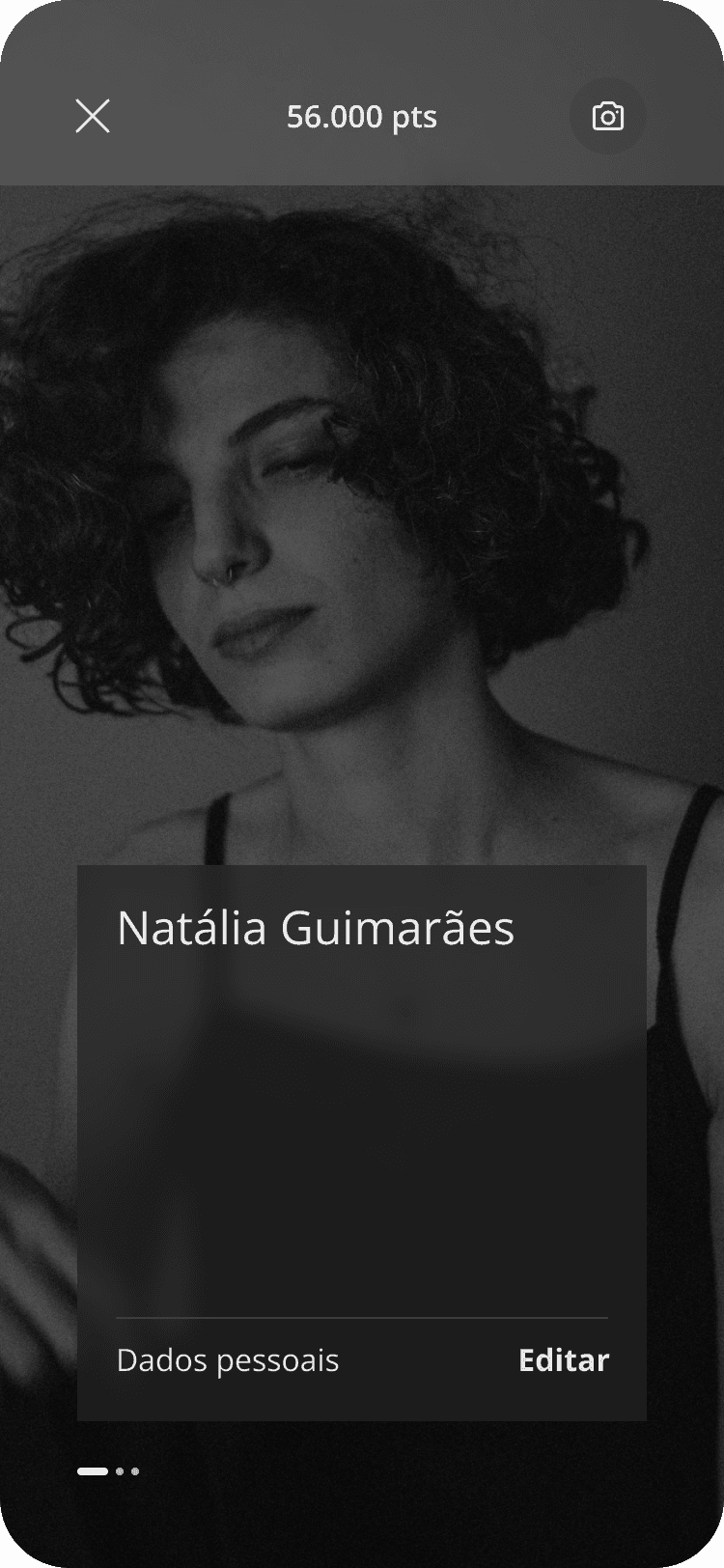
Based on these insights, we developed a dedicated concept for Santander Select, creating a personalized experience in both content and visual language. This delivery redefined how Esfera engaged with high-income customers, reinforcing exclusivity, belonging, and perceived value while maintaining integration with the bank’s broader ecosystem.
Impact & Legacy
a new way of thinking about loyalty
This project proved that design can transform complexity into lasting value. The solutions developed throughout these sprints were successfully adopted by Santander and continue to be used as part of the Esfera experience today.
More than a redesign, this work established a new way of thinking about loyalty, structure, and user experience within the bank’s ecosystem — reinforcing that when meaning and structure meet, design becomes durable.
